About the project
Aims of the project
- To unify information and navigation systems for public transport and public spaces
- To improve the aesthetics and clarity of information
- To streamline and improve the management and maintenance of individual elements of the information system
- To reduce dependence on individual automobile transport
What is missing most of all in Prague?
- Inadequate pedestrian navigation within the city centre and on the outskirts
- Lack of distinctive signage at metro entrances and excessive advertising smog
- Lack of neighbourhood maps at public transport stops
- Lack of navigation to train stops
- Lack of on-line information at public transport stops
Project timeline
The unified information system is a long-term project consisting of several interrelated or parallel activities. The approval of the Implementation Study was followed by a graphic design competition, while other partial support projects will be addressed to start the testing phase, followed by the gradual implementation of the new system.
- 2021–2022 – graphic design competition
- 2021–2023 – preparation of pilot projects
- 2022–2025 – implementation of pilot projects
- 2023–2024 – user surveys
- from 2023 – gradual citywide implementation
The journey to a Legible Prague
 |
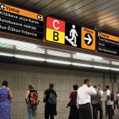
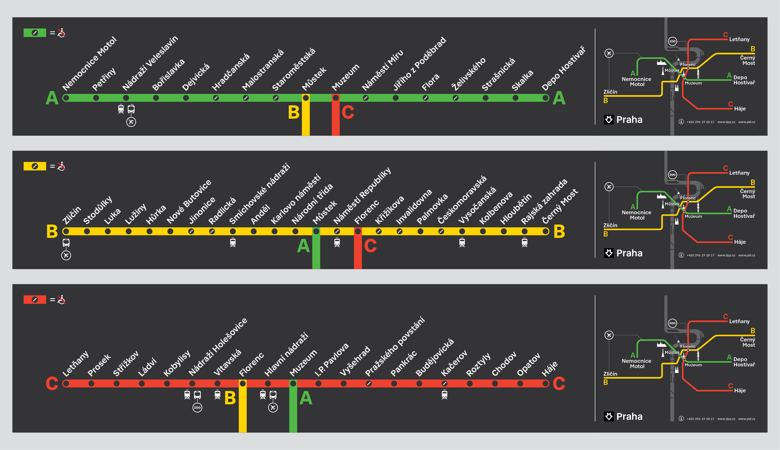
BASICS OF PRAGUE TRAFFIC NAVIGATION The Prague Metro opened in 1974. The graphic design of the individual navigation elements was the work of artists such as Rostislav Vaněk and Jiří Rathouský, whose iconic metro sign can still be seen today, with only minor changes. |
 |
THE BIGGEST GRAPHIC COMPETITION OF ALL TIME In April 2021, Czechdesign begin the demanding preparations for an international competition featuring multidisciplinary teams from all over the world. |
 |
A SYSTEM THAT HAS BEEN HALF A CENTURY IN THE MAKING However, Vaněk’s timeless design has never been fully implemented and now, after more than 30 years, it is no longer suitable as a reliable wayfinding system in a modern major city. Discussions on how to revise are therefore launched in 2017. |
 |
THE CZECH TEAM DID WELL IN THE FACE OF INTERNATIONAL COMPETITION A year later, the winning design by the Czech team, the Side2 graphic design studio, A69 architekti and the typeface company Superior Type, is presented in April 2022. |
 |
A NEW PRAGUE WAYFINDING SYSTEM IS EMERGING In November 2019, a feasibility study mapping the requirements for the new Prague wayfinding system is presented at CAMP in Prague. |
 |
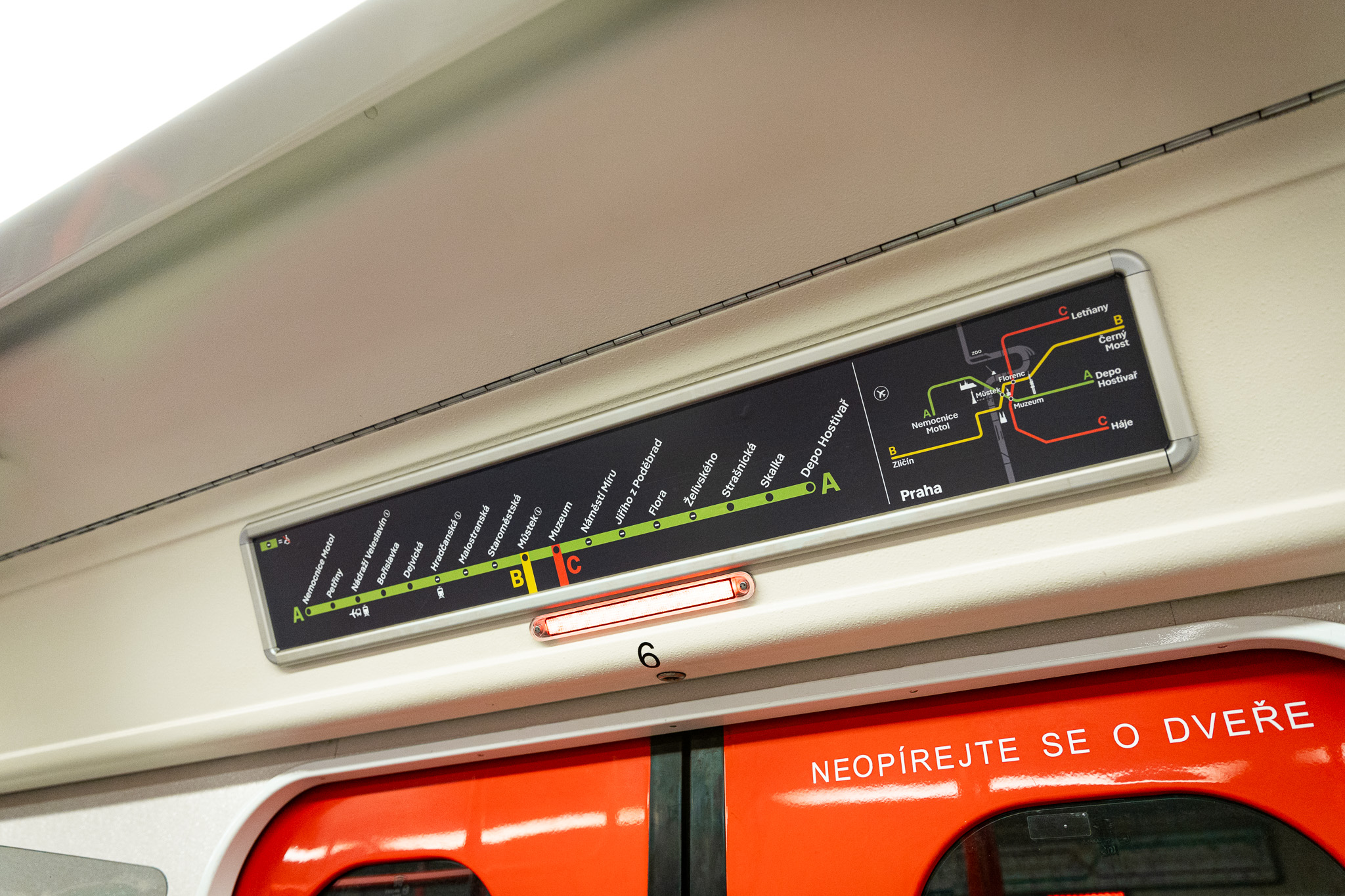
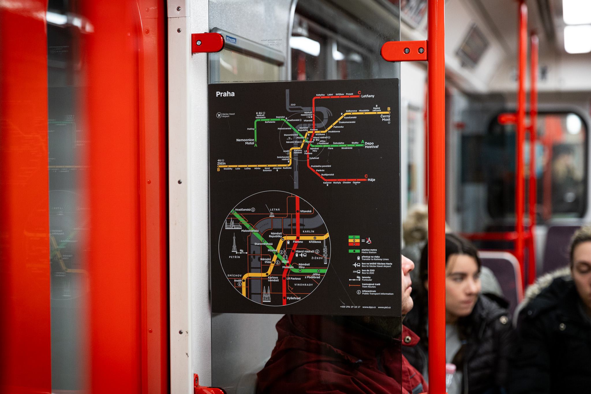
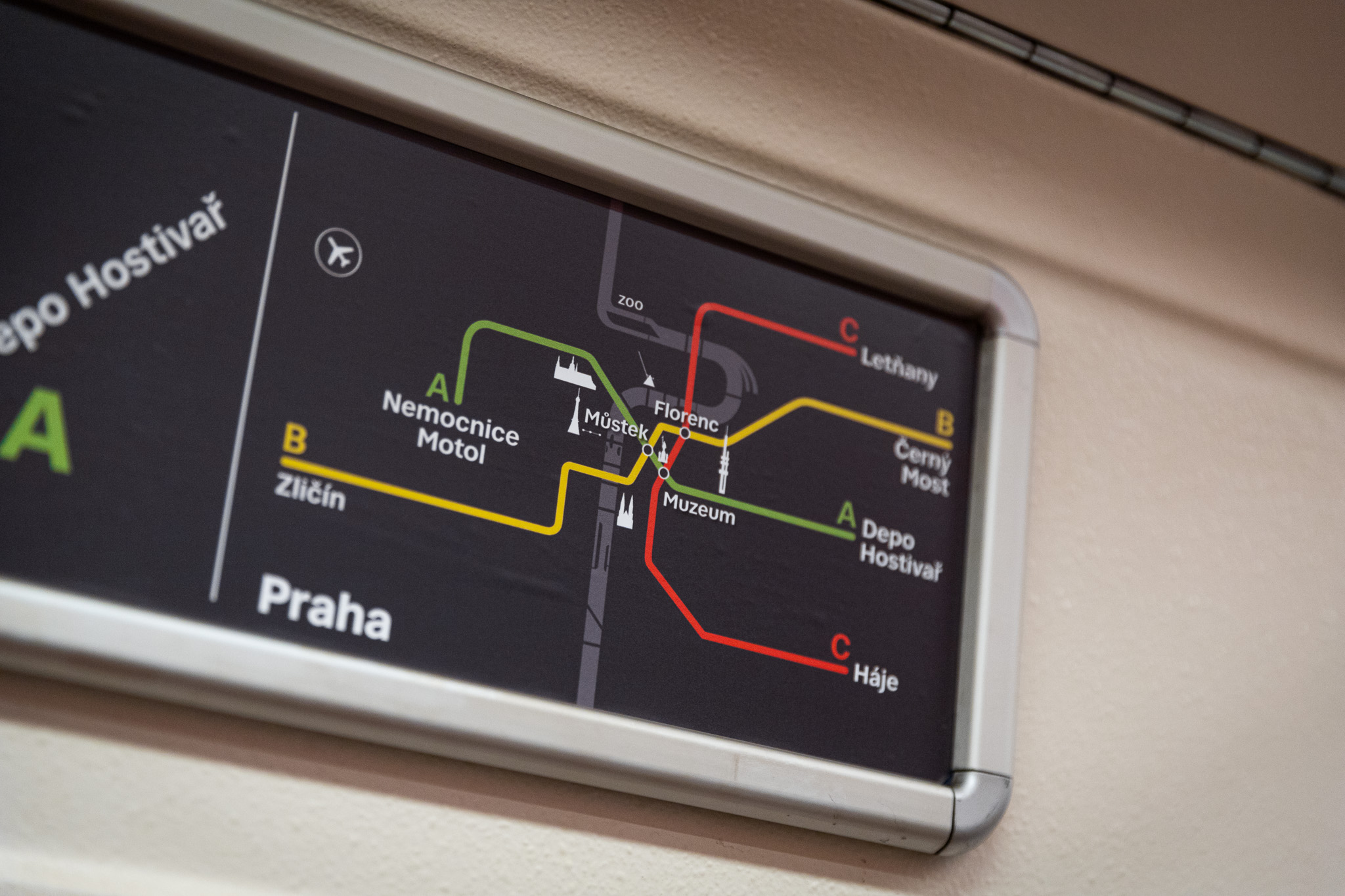
THE JOURNEY TO A LEGIBLE PRAGUE Since autumn 2022, we have been gradually testing new graphics at metro stations and surface transport stops. We are installing so-called totems at metro stations and train stations, highlighting the presence of these stations from afar. You can meet the Prague pedestrian, a guide for walking, more and more often in Prague, for example on Wenceslas Square or in the Prague 7 area. The new graphics are also gradually being applied at surface public transport stops, train stations, but also in vehicles. |
Our Team
Who is behind Legible Prague?
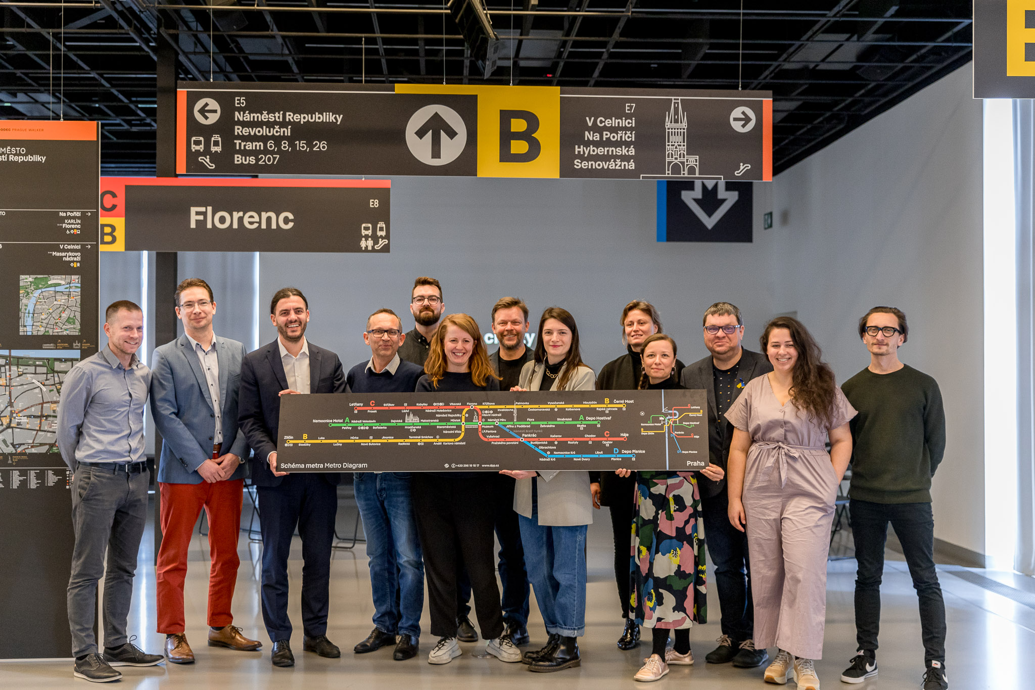
The project is administered on behalf of the city by ROPID in close cooperation with other municipal companies (the Prague Public Transit Company (DPP), the Prague Institute of Planning and Development, the City of Prague Technical Road Administration, Prague City Communications, Prague City Tourism, Operátor ICT and selected departments of Prague City Hall). In addition to the permanent participants making up the working group, the members involved also mediate the opinions of the relevant professional staff or departments in specific cases.
The implementation study for the unified information system for ROPID was prepared by a consortium of Ernst&Young, PRO CEDOP and Beef Brothers in cooperation with experts from CTU and Germany.
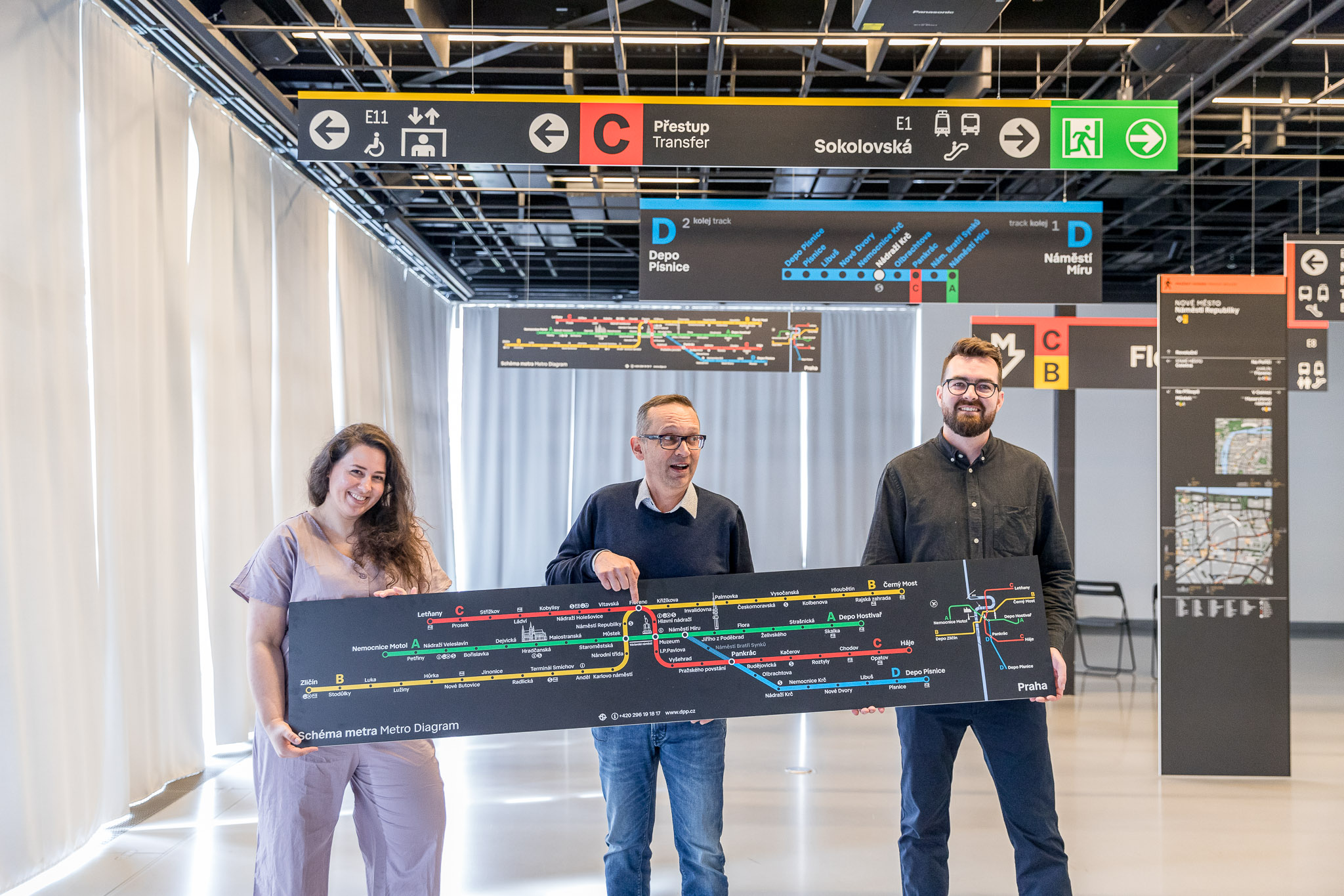
The graphic design competition was organised by Czechdesign, which continues to work with us to raise awareness and promote Legible Prague. The winner of the competition for the design of Legible Prague was the Side2 studio in collaboration with A69 architekti and the typeface company Superior Type.
The Legible Prague project team, led by ROPID and in close cooperation with other organisations of the City of Prague (Prague Public Transit Company (DPP), the Prague Institute of Planning and Development, Operátor ICT, Prague City Tourism, the City of Prague Technical Road Administration, Prague City Communications, Prague City Technology, as well as the individual departments of Prague City Hall, the Central Bohemian Region – Integrated Transport of the Central Bohemia Region and also the Railway Administration) subjects prototypes of new elements not only to technical resistance tests in the physical environment, but also to a series of user surveys conducted amongst the general public. We are interested in what Prague residents and visitors to the city think of these new elements, especially in terms of how easy they are to read and understand and, above all, their functionality in the broader context of the individual locations.
Palmovka survey
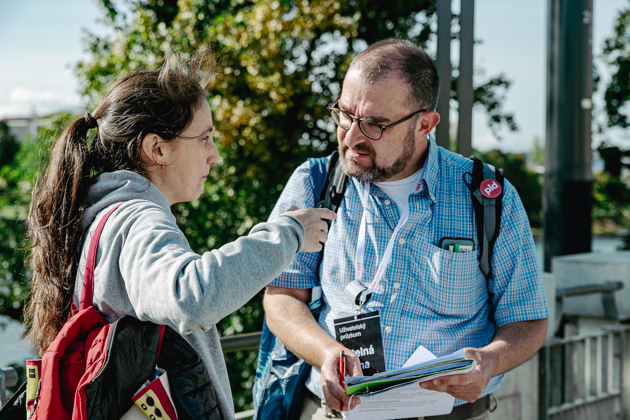
As part of the Legible Prague project, a user survey was conducted amongst the general public at Palmovka metro station in spring 2023. We focused on pilot designs for the system applied midway through this station on existing carriers. The aim of the survey was to carry out an in-depth investigation into how users find their way around the Prague public transport system, evaluate the accessibility, usability, legibility, visibility and clarity of the carrier graphic designs from a user perspective, but also to determine the appropriate location for each individual carrier in relation to critical places in the space or to identify any excess or missing information on the carriers.
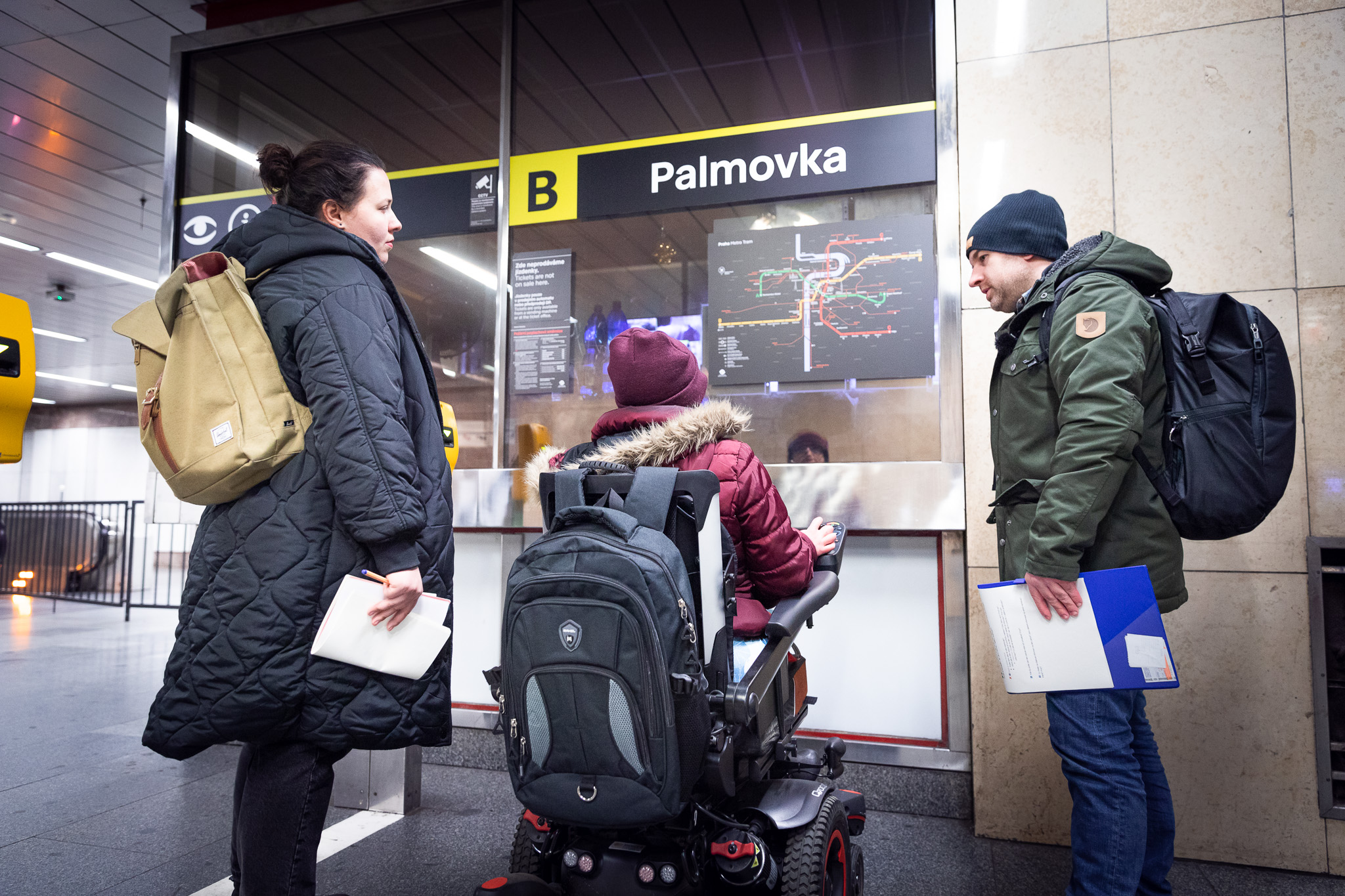
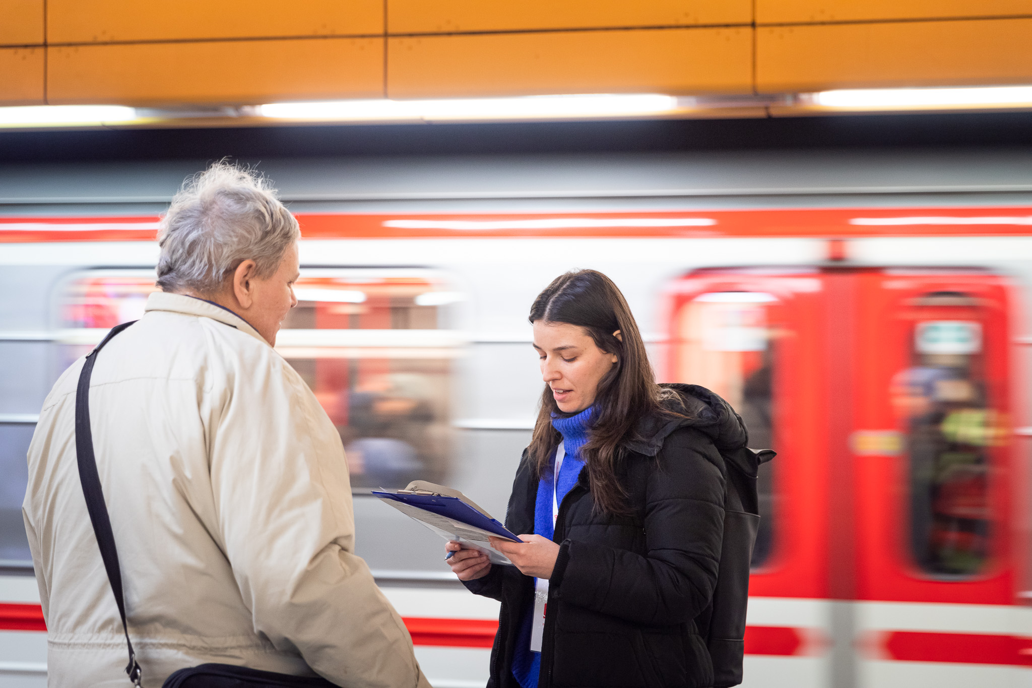
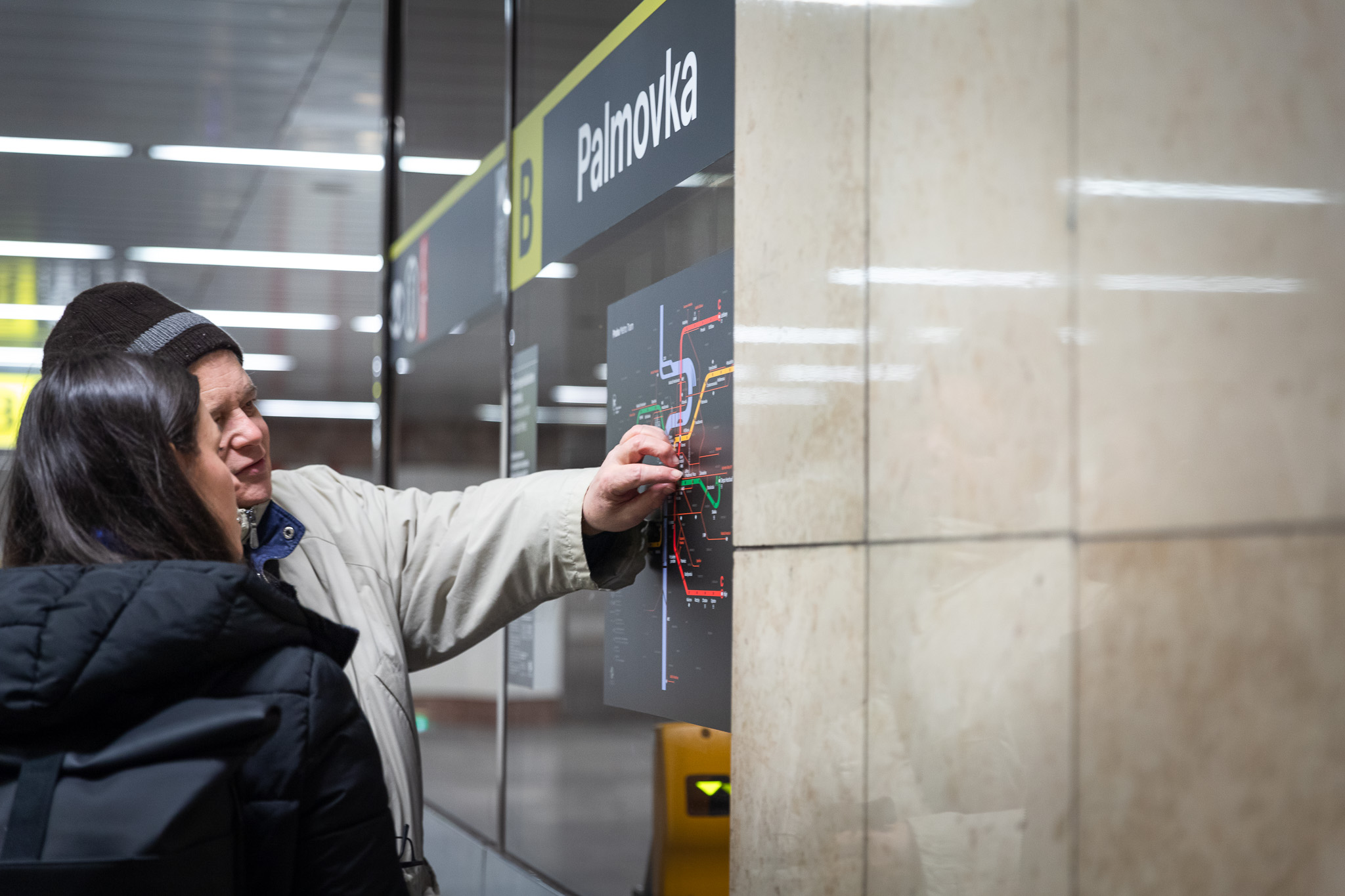
Palmovka is the “project laboratory”, the pilot station where we’ll be gradually testing all the elements of the new wayfinding system for this large interchange. In spring this year, we conducted an initial survey to get feedback about the wayfinding system in the middle of the metro station. The qualitative survey, which involved almost a hundred respondents, combined two methods to obtain the widest possible feedback. These included in-depth interviews with a carefully selected representative sample of respondents, i.e. accompanied visits, and observations of natural passenger behaviour with targeted questions.
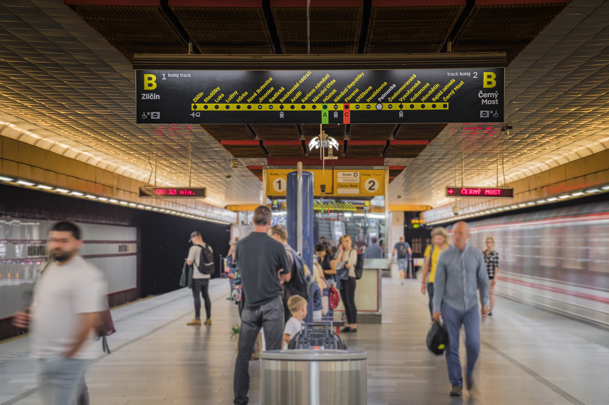
Overall, the white and yellow font against the dark background was confirmed as being legible and a good contrast. This was also backed up by representatives of the blind and partially sighted from the SONS organisation. However, the use of grey for the additional texts was something of a problem. Suggestions included coming up with a new way of marking the wheelchair accessibility of stations, as well as the legibility of the metro diagram at the station entrance. There were also recurring complaints about the location of the carrier showing the full list of stations (“thermometer”) far beyond the entrance to the platform, which is where people decide which side to take.
“On the basis of these findings, we have modified the basic directional boards for the reconstructed Jiřího z Poděbrad station that show the way to the individual directions of the metro journey, and created two modified versions of the thermometer and a completely new “vertical thermometer”. The schematic map of the metro has also been modified, which we are now testing with the new detail of the centre in selected carriages,” says Tomáš Machek of the Side2 design studio.
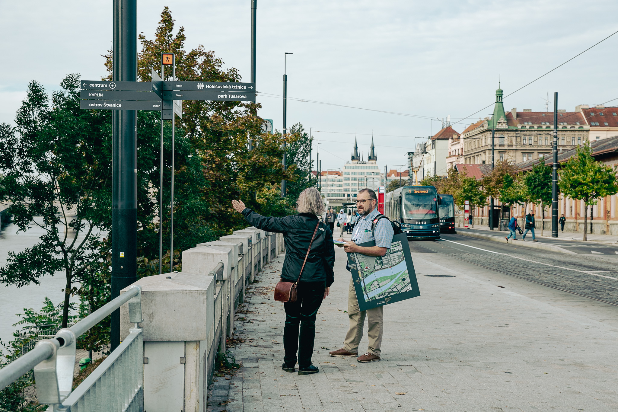
HolKa survey
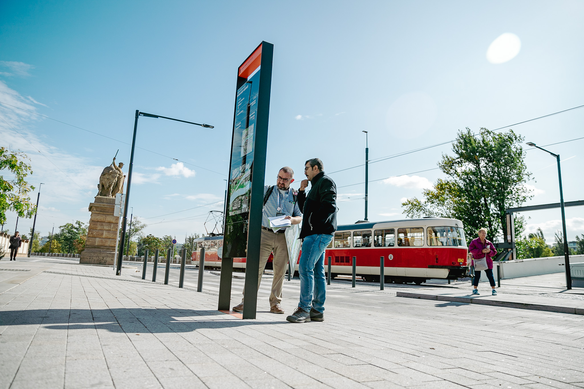
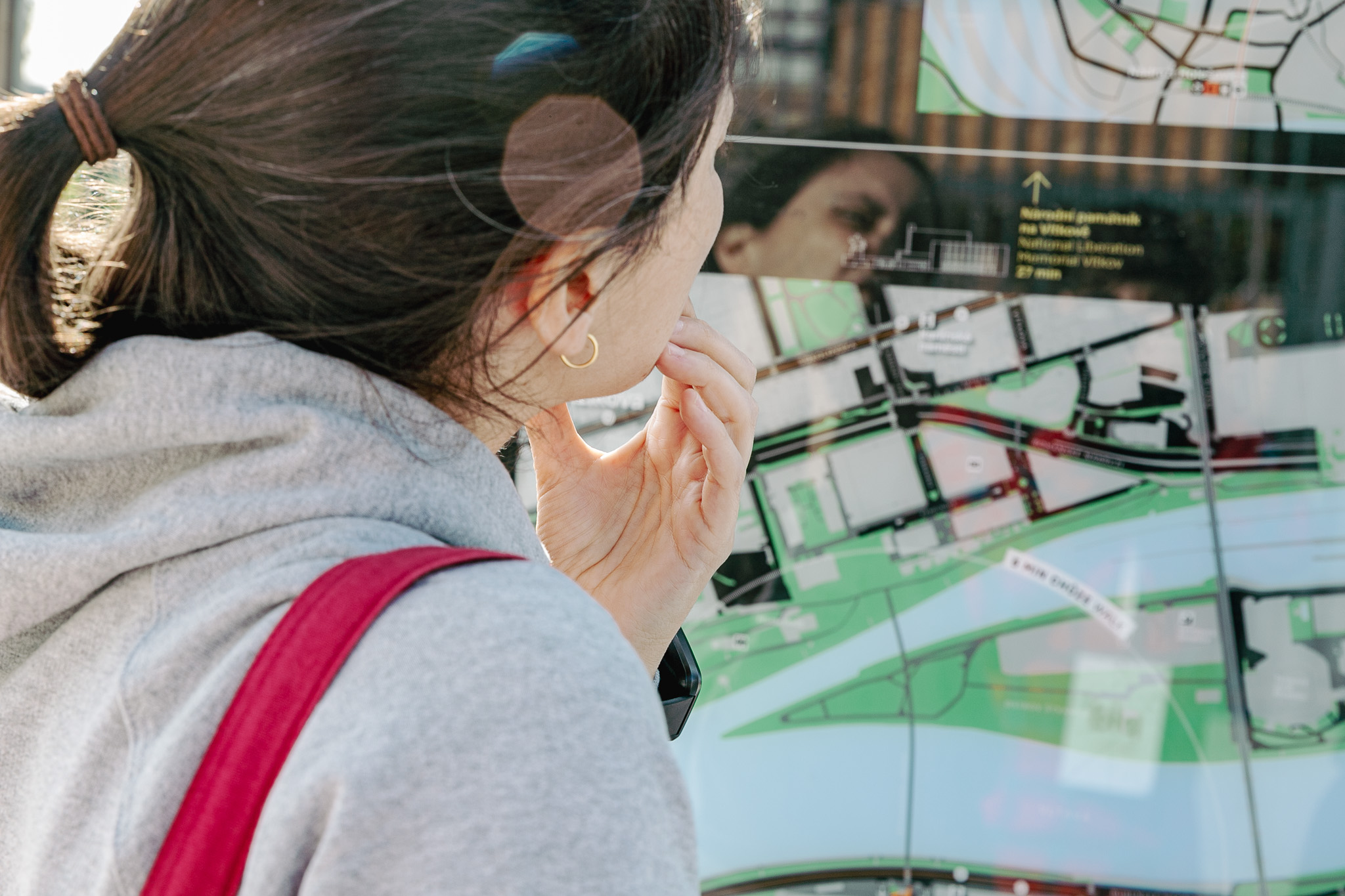
In autumn this year we piloted the pedestrian wayfinding elements by the new Štvanice Footbridge. The survey was conducted in front of the Holešovice Market Hall, where our pollsters conducted in-depth interviews with a carefully selected representative sample of respondents to determine whether the obelisk and directional sign were as effective as they should be. They were particularly interested in seeing whether the information was legible and easy to understand, but also if the elements were in a suitable place and clearly visible.
Research on information boards in the metro and thermometers
At the beginning of 2024, the design of information display in metro cars was subjected to user research. In in-depth qualitative interviews and an extensive survey, we investigated the readability and comprehensibility of individual elements in the schemes, what people lack or have in the schemes, which results for new designs from a functional comparison with the original graphics, and which variant of the scheme above the doors they prefer. Based on these surveys, the Side2 graphic studio refined the system to its final form, which reflects as much as possible the comments of the public and suggestions from practice. The new “dachshunds” are subsequently installed in all metro cars.
Working with this, we also examined the basic navigation elements in the Jiřího z Poděbrad metro station. Based on the survey results, we adjusted the list of stations on the route, the so-called thermometer, we fine-tuned a completely new element “vertical thermometer” and the research brought us valuable insights for finalizing the Metro Manual, according to which other metro stations will gradually be given the new graphics.
You can get involved in the survey, too.
Anyone willing to help us on our way to a Legible Prague can get involved in the development of Prague’s new wayfinding system. Passengers can easily give us their suggestions, criticism and compliments via an online questionnaire, which can be found by clicking this link: I want to give feedback.
For those who have the desire and space to become a respondent in one of the next professional surveys conducted amongst the general public, a recruitment questionnaire has been prepared, which can be found by clicking this link: I want to be a respondent of Legible Prague.
We would like to sincerely thank all those who provide us with feedback, and especially those who take the time to participate in one of the surveys. Depending on the scope of the specific surveys, we have rewards for participants such as gift packages or vouchers for leading Czech e-shops.
And what comes next?
In the coming months, we will continue our research with passengers. We are going to verify both other elements with new graphics and the overall content and structure of information at stops and in vehicles. We will also test the new pedestrian navigation system on the streets of Prague to finally determine the frequency of individual elements. We will also subject the new form of digital information in vehicles and printed information at stops to user testing.
After evaluating individual research, scientific teams of experts in research in public space, the data obtained will be reflected in the final adjustments to the form and content of individual elements.
In the future, we plan to verify the Readable Prague system as a whole to verify the comprehensive usability of the new elements of navigation operation.
Wayfinding around the world
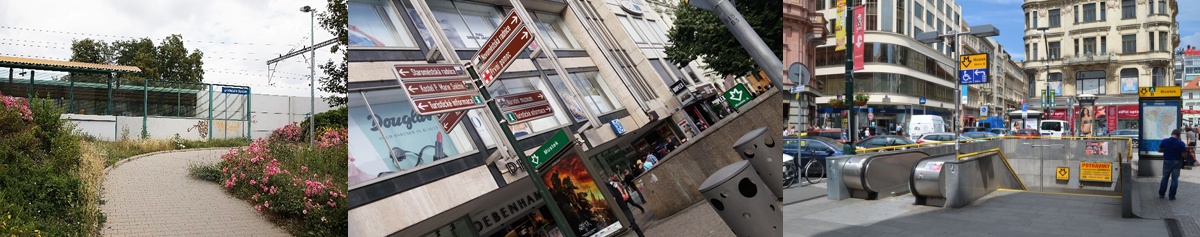
London
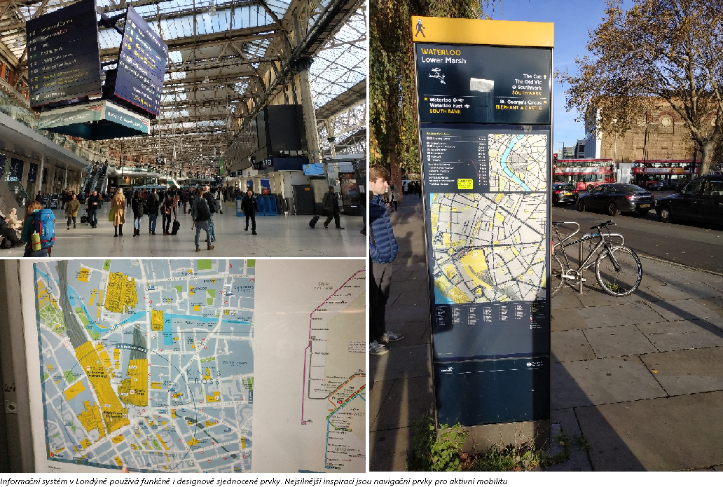
In London, a survey was conducted from the perspective of an international visitor unfamiliar with the ins and outs of the local information and wayfinding system, in the central part of the city. All modes of transport were mapped, with an emphasis on the underground system and pedestrian movement around the city. For most transport services, the information system is standardised, communicated in a simple way, uses functional and unified design elements and is consistent across transport subsystems and the public space. The greatest inspiration drawn from London was the system of information and wayfinding elements for active mobility, especially for pedestrians (Legible London).
Munich
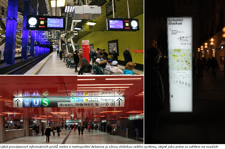
Munich’s information system has a high degree of interaction between the individual information elements and the uniformity of their logic across the various modes of transport. Another strength of the system is the close link between the information elements of the metro and the metropolitan railway (U-Bahn and S-Bahn) – the backbone subsystems of the city, which have different operators. Another important aspect of the information system setup is that it works with light in enclosed areas of stations and makes efficient use of available media for information surfaces. The downside of the system is the way transport subsystems are connected with the public space and the scarcity of elements for finding one’s way around the city space.
Vienna
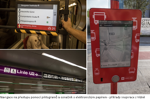
Vienna has its metro system (U-Bahn), surface transport and railway lines (S-Bahn); there is little interaction between their separate information and orientation systems. Good practice applied by the city of Vienna that could be incorporated into the unified information system is the fact that a vision and priorities are set for the information system, there are rules in place for advertising (reducing visual smog), there is greater use of electronic information elements and new technologies in the system, greater adaptation of wayfinding to the specific stop through the systematic placement of maps of the immediate vicinity at stops, and sufficient staffing to take care of the information and wayfinding systems, including the job of passenger information coordinator.
Brno
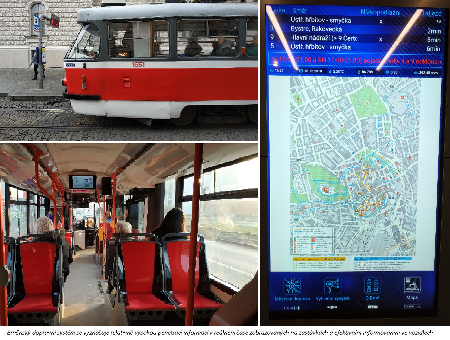
Brno’s system is characterised by close cooperation between the individual stakeholders in the transport information systems (specifically between the organiser KORDIS and the transport company DPMB), including the sharing of information, which is highly automated. The entire transport system also shows very good quality information about emergencies and line closures, a relatively high amount of real-time information displayed on displays at stops, and electronic panels displaying effective information for passengers in the vehicles. The system’s weaknesses include the lack of any link between the transport systems and public space and the scarcity of aesthetically pleasing directional signs for finding one’s way around the city space.
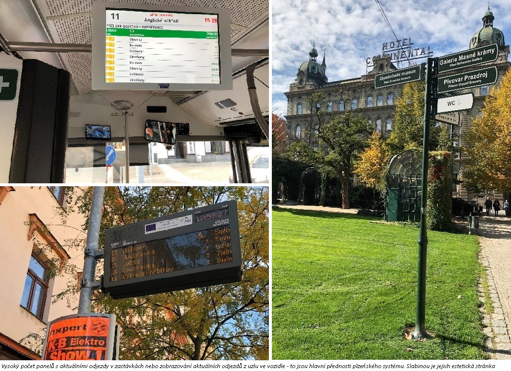
Plzeň
Plzeň is characterised by a large number of panels showing current departures at stops, displaying current departures from the junction in the vehicle, and displaying information about current public transport and regional bus departures at the main station. Advantages of the system include the fact that passengers are notified of incidents via a mobile app, as well as the existence of a dispatcher-informant feature. Weaknesses of the Plzeň information system include the provision of information about closures and incidents at the affected stops and the aesthetic aspects of certain traffic information.